Poverty is universal.
For you always have the poor with you, but you will not always have me.
Matthew 26:11
It is our duty as human persons to love our neighbor and work for the betterment of the worldwide human community. This project is an analysis of potential contributing factors to poverty in the United States and potential reactive/proactive measures we may advocate for in order to reduce poverty rates.
Data Sources
Poverty, unemployment, and education rates (2021):
https://www.ers.usda.gov/data-products/county-level-data-sets/county-level-data-sets-download-data/.
Household size (2021):
https://data.census.gov/table/ACSST1Y2021.S1101?q=2021+household+by+state.
State Minimum Wages (2024):
https://www.ncsl.org/labor-and-employment/state-minimum-wages.
Violent Crime (2019):
https://ucr.fbi.gov/crime-in-the-u.s/2019/crime-in-the-u.s.-2019/topic-pages/tables/table-5.
Housing Price Index By State (2021):
https://www.fhfa.gov/data/hpi/datasets?tab=quarterly-data
Consumer Spending by State (2021):
https://www.bea.gov/data/consumer-spending/state
Rent by State (2021):
Variables:
Dependent Variables
- % Poverty Rate (2021, by county)
Independent Variables
- % Population with a bachelor’s degree or higher (over the period 2018-2022, by county)
- % Households with cohabitant dependent children (2021, by state)
- Minimum Wage (2024, by state)
- Violent Crime per Capita (2019, by state)
My first analysis of this data was in LibreOffice Calc, using a multiple linear regression model.
Table 1: sample of cleaned data
| FIPS_Code | Stabr | Area_name | PCTPOVALL_2021 | EDUCATION | PCT_HOUSEHOLDS_CHILDREN | PCT_UNEMPLOYMENT | MIN_WAGE | Violent_crime_per_100000 | OUTLIER |
| 01003 | AL | Baldwin County | 10.8 | 32.5615787141814 | 28.7934440593649 | 4.1 | 7.25 | 510.8 | no |
| 01005 | AL | Barbour County | 23 | 11.8811881188119 | 28.7934440593649 | 4.1 | 7.25 | 510.8 | no |
| 01007 | AL | Bibb County | 20.6 | 10.9199372056515 | 28.7934440593649 | 4.1 | 7.25 | 510.8 | no |
| 01009 | AL | Blount County | 12 | 14.7414067667883 | 28.7934440593649 | 4.1 | 7.25 | 510.8 | no |
| 01011 | AL | Bullock County | 32.1 | 9.37674678591392 | 28.7934440593649 | 4.1 | 7.25 | 510.8 | no |
FIPS_Code
Federal Information Processing Standard code, used to uniquely identify geographical areas (county specific)
Stabr
State Abbreviation
Area_name
Name of the county
Dependent Variables
-
PCTPOVAL_2021: % Poverty Rate (2021, by county)
Independent Variables
-
EDUCATION: % Population with a bachelor’s degree or higher (over the period 2018-2022, by county) -
PCT_HOUSEHOLDS_CHILDREN: % Households with cohabitant dependent children (2021, by state) -
PCT_UNEMPLOYMENT: % of population unemployed (2022, by county) -
MIN_WAGE: Minimum Wage (2024, by state) -
Violent_crime_per_100000: Violent Crime per Capita (2019, by state)
Table 2: sample statistics
| Number of Observations = 2914 | |||||
| Mean | Median | St. Dev | Minimum | Maximum | |
| Poverty (percent of population) | 14.726 | 13.7 | 5.656 | 3.9 | 43.9 |
| Percent of Households with cohabitant dependent children (percent) | 29.751 | 28.985 | 3.101 | 24.482 | 38.282 |
| Percent of Population with a Bachelor’s degree or higher (percent) | 22.857 | 20.792 | 8.895 | 5.163 | 53.460 |
| Percent Unemployed (percent) | 5.203 | 5 | 1.676 | 2.9 | 11.7 |
| Minimum Wage (dollars $) | 9.97 | 10.3 | 2.976 | 7.25 | 16.28 |
| Violent Crime per Capita (per 100000) | 358.777 | 370.8 | 98.532 | 115.2 | 595.2 |
Washington had the highest minimum wage at $16.28. The highest violent crime rates were by far in Arizona, Louisiana, and at the top with a rate of 595.2, Tennessee. Connecticut has the lowest unemployment at 3%, whereas Nevada has an unemployment of more than double that- an average of 6.441% state-wide. An interesting observation is that every single county in Arkansas was an outlier, because violent crime was greater than 3 standard deviations above the mean (>694.136). It is interesting to note that the entire state of Arkansas has a violent crime per capita of 867.1. This is almost 25% higher than the entire U.S. average.
The dataset was cleaned using an “outliers” column. An example of the function in this column was:
=IFS(OR(E2>$E$2920,E2<$E$2921),"yes",OR(F2>$F$2920,F2<$F$2921),"yes",OR(G2>$G$2920,G2<$G$2921),"yes",OR(H2>$H$2920,H2<$H$2921),"yes",OR(I2>$I$2920,I2<$I$2921),"yes",1,"no")Where the 2920 and 2921 rows of E, F, G, H, and I have the values for three standard deviations above and below the mean. The function simply checked whether or not any cell in a given county’s row was more than three standard deviations above or below the mean. This made it easy to clean using a simple filter for all rows where the “outlier” column was a “yes,” and then deleting those rows.
Table 2: findings
| Ordinary Least Square Estimates | ||
| Dependent variable: Poverty Rate | ||
| Independent Variable | Coefficient | p-value |
| Intercept | 20.105 | 0.000 |
| Percent of Population with a Bachelor’s degree or higher | -0.308a | 0.000 |
| Percent Unemployed (percent) | -0.0396 | 0.478 |
| Minimum Wage | -0.072b | 0.020 |
| Violent Crime per Capita | .006a | 0.000 |
| Percent of households with cohabitant dependent children | .016 | 0.569 |
- Significant at 1%
- Significant at 5%
- Significant at 10%
The overall significance (F) came out to 0.000, and the adjusted R2 came out to 0.26166695634134. This means that the overall model is significant, but it only describes about a quarter of the data.
Interpretations of significant coefficients:
Education
As the percent of population with a bachelor’s degree or higher increases by 1 percentage point, predicted poverty rate decreases by .308 percentage points.
Minimum Wage
As minimum wage increases by one dollar, predicted poverty rate decreases by .072 percentage points.
Violent Crime
As violent crime per capita increases by one violent crime, predicted poverty rate increases by .006 percentage points.
Even though percent of population with a bachelor’s degree or higher, minimum wage, and violent crime per capita are significant, it seems as though the most important by far is education. A one percentage point increase in the percent of population with a bachelor’s or higher will decrease poverty by approximately 4.28 times that of a one dollar increase in minimum wage, and about 51.3 times that of a one crime decrease in violent crime per capita.
Although this sounds all well and good I made a fundamental error: I did not visualize my data before I even started! Data visualization is the first thing any good analyst should start with. Because I did not visualize my data, I went in the wrong direction. I assumed all my independent variables would have a linear correlation.
As is common among men, we are wrong. This is reflected in the graph shown at the top of the page:
Fig 1: Poverty vs. Education
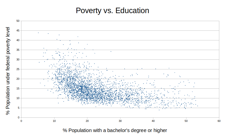
This looks like the least linear “linear relationship” I have ever seen. In fact, it looks like a second order relationship, or perhaps even a logistic relationship with a base of <1.
If this assumption was wrong, how does the assumption of linearity for the other independent variables hold up?
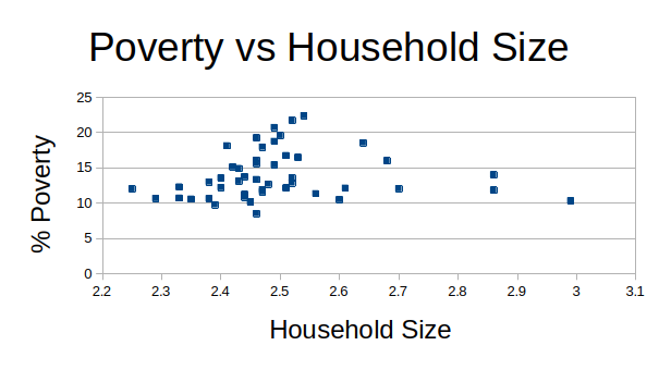
Children
For this independent variable, I decided to use a different metric than in my first regression: family size instead of cohabitant dependent children. There are many cultures (such as my own, Filipino) who live in multi-generational housing where the elders are taken care of by children. This would mean that there are actually more cohabitant dependent people accounted for than just children.
The data was in an odd configuration, however.
Table 3: example of uncleaned household size data
| Label (Grouping) | Alabama!!Total!!Estimate | Alabama!!Total!!Margin of Error | Alabama!!Married-couple family household!!Estimate | Alabama!!Married-couple family household!!Margin of Error | Alabama!!Male householder, no spouse present, family household!!Estimate | Alabama!!Male householder, no spouse present, family household!!Margin of Error | Alabama!!Female householder, no spouse present, family household!!Estimate | Alabama!!Female householder, no spouse present, family household!!Margin of Error | Alabama!!Nonfamily household!!Estimate | Alabama!!Nonfamily household!!Margin of Error |
| HOUSEHOLDS | ||||||||||
| Total households | 1967559 | ±10,527 | 904392 | ±12,967 | 90366 | ±5,199 | 276625 | ±7,720 | 696176 | ±12,796 |
| Average household size | 2.5 | ±0.01 | 3.14 | ±0.02 | 3.44 | ±0.11 | 3.45 | ±0.07 | 1.18 | ±0.01 |
| FAMILIES | ||||||||||
| Total families | 1271383 | ±13,413 | 904392 | ±12,967 | 90366 | ±5,199 | 276625 | ±7,720 | (X) | (X) |
| Average family size | 3.15 | ±0.03 | 3.12 | ±0.03 | 3.06 | ±0.11 | 3.27 | ±0.06 | (X) | (X) |
| AGE OF OWN CHILDREN | ||||||||||
| Households with own children of the householder under 18 years | 490580 | ±10,590 | 314991 | ±8,944 | 38859 | ±4,205 | 136730 | ±5,797 | (X) | (X) |
| Under 6 years only | 20.2% | ±1.1 | 20.7% | ±1.4 | 24.0% | ±4.0 | 17.8% | ±1.9 | (X) | (X) |
| Under 6 years and 6 to 17 years | 19.4% | ±1.3 | 19.8% | ±1.3 | 17.6% | ±3.8 | 18.9% | ±2.2 | (X) | (X) |
| 6 to 17 years only | 60.5% | ±1.5 | 59.5% | ±1.7 | 58.4% | ±4.9 | 63.2% | ±2.6 | (X) | (X) |
| Total households | 1967559 | ±10,527 | 904392 | ±12,967 | 90366 | ±5,199 | 276625 | ±7,720 | 696176 | ±12,796 |
| SELECTED HOUSEHOLDS BY TYPE | ||||||||||
| Households with one or more people under 18 years | 28.8% | ±0.6 | 38.4% | ±0.9 | 53.0% | ±3.7 | 60.7% | ±1.7 | 0.5% | ±0.2 |
| Households with one or more people 60 years and over | 42.6% | ±0.4 | 42.5% | ±0.7 | 35.7% | ±3.3 | 31.8% | ±1.4 | 48.0% | ±1.0 |
| Households with one or more people 65 year and over | 32.2% | ±0.3 | (X) | (X) | (X) | (X) | (X) | (X) | 37.2% | ±0.9 |
| Householder living alone | 30.9% | ±0.6 | (X) | (X) | (X) | (X) | (X) | (X) | 87.2% | ±0.8 |
| 65 years and over | 12.4% | ±0.4 | (X) | (X) | (X) | (X) | (X) | (X) | 35.2% | ±0.9 |
| UNITS IN STRUCTURE | ||||||||||
| 1-unit structures | 73.5% | ±0.5 | 86.4% | ±0.6 | 69.9% | ±2.9 | 65.2% | ±1.6 | 60.6% | ±1.1 |
| 2-or-more-unit structures | 14.9% | ±0.4 | 3.9% | ±0.4 | 11.9% | ±2.0 | 20.9% | ±1.4 | 27.0% | ±0.9 |
| Mobile homes and all other types of units | 11.6% | ±0.4 | 9.7% | ±0.5 | 18.3% | ±2.4 | 13.9% | ±0.9 | 12.4% | ±0.8 |
| HOUSING TENURE | ||||||||||
| Owner-occupied housing units | 70.0% | ±0.5 | 86.1% | ±0.7 | 63.3% | ±3.5 | 53.0% | ±1.9 | 56.7% | ±1.1 |
| Renter-occupied housing units | 30.0% | ±0.5 | 13.9% | ±0.7 | 36.7% | ±3.5 | 47.0% | ±1.9 | 43.3% | ±1.1 |
This data goes on for all 50 states. It requires some cleaning, specifically for the “average household size” row at the top. After cleaning and transposing the data, this is what it looked like:
Table 4: transposing the household size data
| Label (Grouping) | Average household size |
| Alabama!!Total!!Estimate | 2.5 |
| Alabama!!Total!!Margin of Error | ±0.01 |
| Alabama!!Married-couple family household!!Estimate | 3.14 |
| Alabama!!Married-couple family household!!Margin of Error | ±0.02 |
| Alabama!!Male householder, no spouse present, family household!!Estimate | 3.44 |
| Alabama!!Male householder, no spouse present, family household!!Margin of Error | ±0.11 |
| Alabama!!Female householder, no spouse present, family household!!Estimate | 3.45 |
| Alabama!!Female householder, no spouse present, family household!!Margin of Error | ±0.07 |
| Alabama!!Nonfamily household!!Estimate | 1.18 |
| Alabama!!Nonfamily household!!Margin of Error | ±0.01 |
And this continued for all 50 states. In order to solve this I had to apply a filter for all rows that did not contain “Total!!Estimate” and delete those rows. This is the final revision:
Table 5: cleaning the household size data
| Label (Grouping) | Average household size |
| Alabama!!Total!!Estimate | 2.5 |
| Alaska!!Total!!Estimate | 2.61 |
| Arizona!!Total!!Estimate | 2.53 |
| Arkansas!!Total!!Estimate | 2.49 |
This continues for all 50 states. Now it is possible to graph poverty rates against this, but it is necessary to use average poverty rate for each state because this household data is not stratified into county like our poverty data.
Unemployment
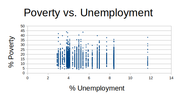
The original data for % unemployment is by county, however it appears as though multiple counties were surveyed together, so within a certain state multiple consecutive counties will have the exact same poverty rate. This produces the graph above. Although this might smother potential trends, perhaps aggregating by state will help visually?
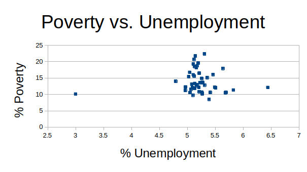
As with household size, there seems to be no slope but an interesting clump of points in the middle. This is a little more clustered.
Minimum Wage
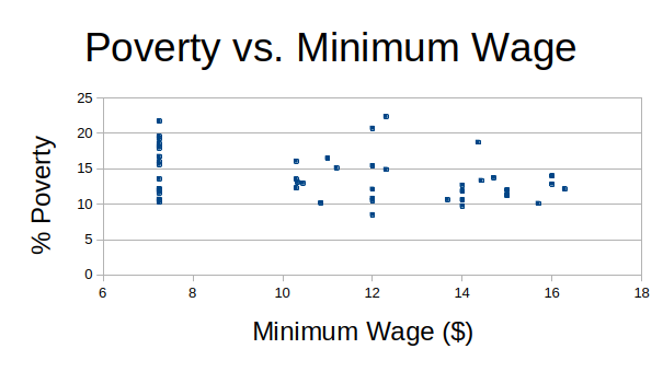
There is no discernible correlation. Slope seems to be 0. It is interesting to note that the many states who have federal minimum wage as the state minimum($7.25/hr) range from near 10% (very low relative to other states) to almost 22% (almost the highest unemployment)
Violent Crime
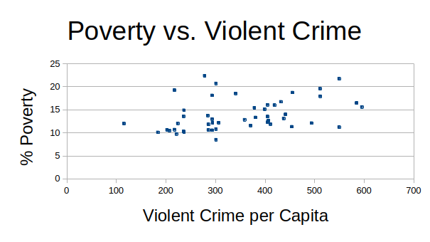
This graph does show a definite positive slope. A question that needs to be asked is:
“Does violent crime drive poverty, or does poverty drive violent crime? If the latter, are there any surrounding variables that impact this relationship?”
I say this because I am quite hesitant to give broad generalizations of an entire socioeconomic population. For example, the most affordable areas could be those with high gang violence. Those with less means (in poverty) would move there, yet not be the cause of this violent crime. This makes sense, and would help explain the relationship between violent crime and poverty.
It seems to be clear that there are certainly missing variables. Perhaps the missing variables would be related to housing costs, or general cost of living. Let’s add in housing prices costs and single parent households to our data.
Note: At first, I tried to aggregate data by state to simplify the analysis however after running a regression all P values were insignificant. The best practice seems to be keeping all county-level data and simply adding state-wide data to those individual counties.
These are what the new graphs look like, both county level and aggregated at state level before cleaning any outliers:
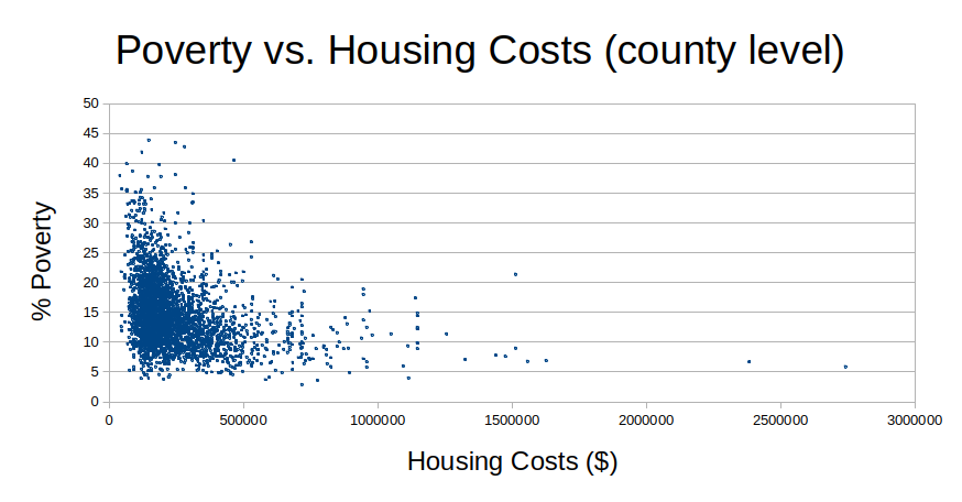
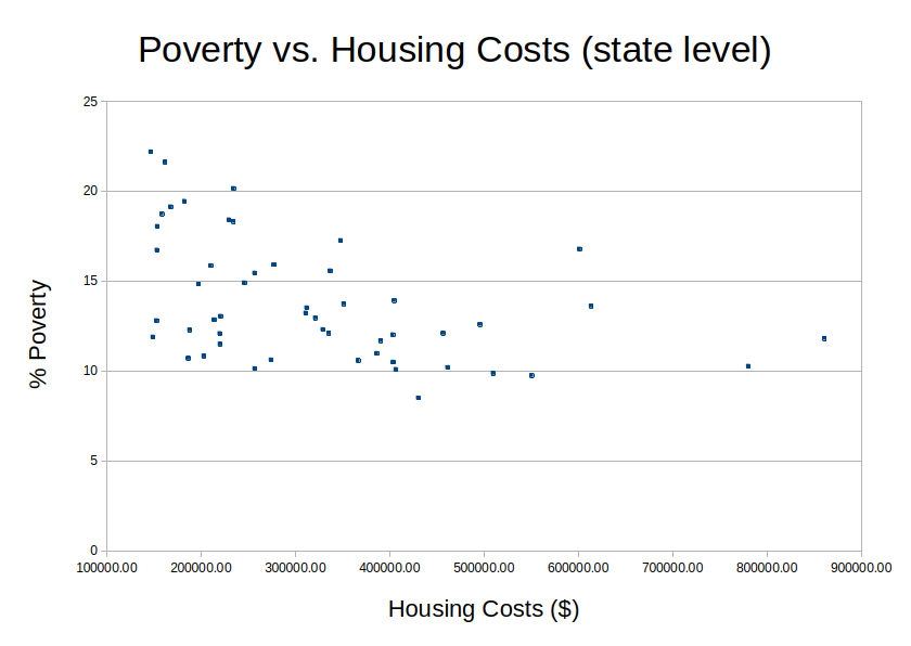
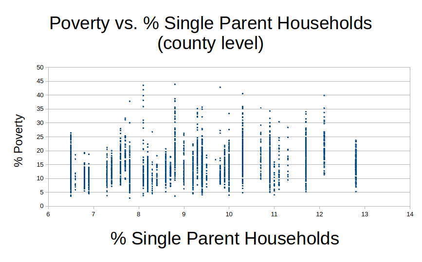
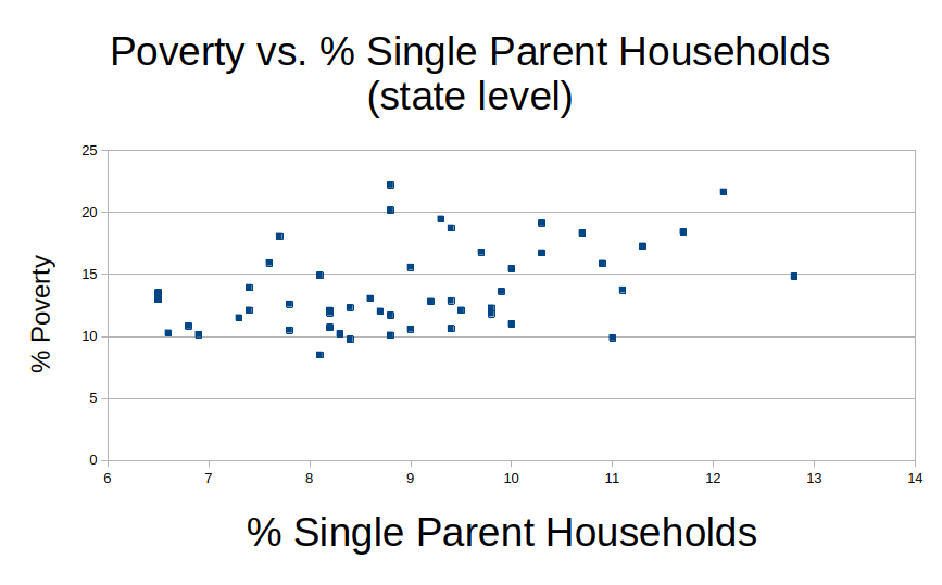
There looks like there are some trends present in this data. Running a power series regression to account for our nonlinear relationships such as education and housing costs, this is the summary:
| Powerseries Estimates | ||
| Dependent variable: Poverty Rate | ||
| Independent Variable | Coefficient | p-value |
| Intercept | 4.196 | 0.000 |
| LN(Percent of Population with a Bachelor’s degree or higher) | -0.480 | 0.000 |
| LN(Percent Unemployed) | -0.020 | 0.186 |
| LN(Minimum Wage) | 0.024 | 0.213 |
| LN(Violent Crime per Capita) | 0.090 | 0.000 |
| L N(Household size) | -0.324 | 0.067 |
| LN(housing_costs) | ||
| LN(%_single_fam_household) | ||
- Significant at 1%
- Significant at 5%
- Significant at 10%
| Coefficients | P-value | |
| Intercept | 4.196 | 0.000 |
| LN(EDUCATION) | -0.480 | 0.000 |
| LN(PCT_HOUSEHOLDS_CHILDREN) | -0.324 | 0.067 |
| LN(PCT_UNEMPLOYMENT) | -0.020 | 0.186 |
| LN(MIN_WAGE) | 0.024 | 0.213 |
| LN(Violent_crime_per_100000) | 0.090 | 0.000 |
| LN(housing_costs) | -0.080 | 0.000 |
| LN(%_single_fam_household) | 0.318 | 0.000 |